 here you can see the changes from old on the left, to new on the right.
Its no master work of UI design, but its certainly different to the old layout! There's a couple small details I added like the dot texture on the touch controls, the repeated diamond shapes across the UI, reprioritising the colours in the loadout view etc. It still feels crowded, but I'm not sure there's much I can do about that, pretty much every element on screen is necessary, and there's many elements that could be added! Honestly I can't say I'm happy with it, but you have to stop working on stuff at some point and this will do.
Once the design was "done" I went onto implementation, this included reworking most of the HUD in such a way that it could be responsive (aka, the same work I've been doing over the past few months) but also in ways that respond to the player's control choices. In the menu, supporting controllers is relatively simple, make sure every button flows onto another in some way, and show indicators. For the game UI you need to show indicators, interactions and more. What I've done in Exoloper that's different to Interloper is having two completely seperate views for interaction. one for Touch and one for Control-Indicators. In Interloper I simply hid the touch controls, and left some buttons (namely utilities and reloads) active. But here, like a good programmer I'm separating my concerns.
I built the control indicators to not just have onscreen indicators for their use, but also to show when they're being interacted with. This way, it should be relatively quick for new players to identify what buttons are doing which actions.

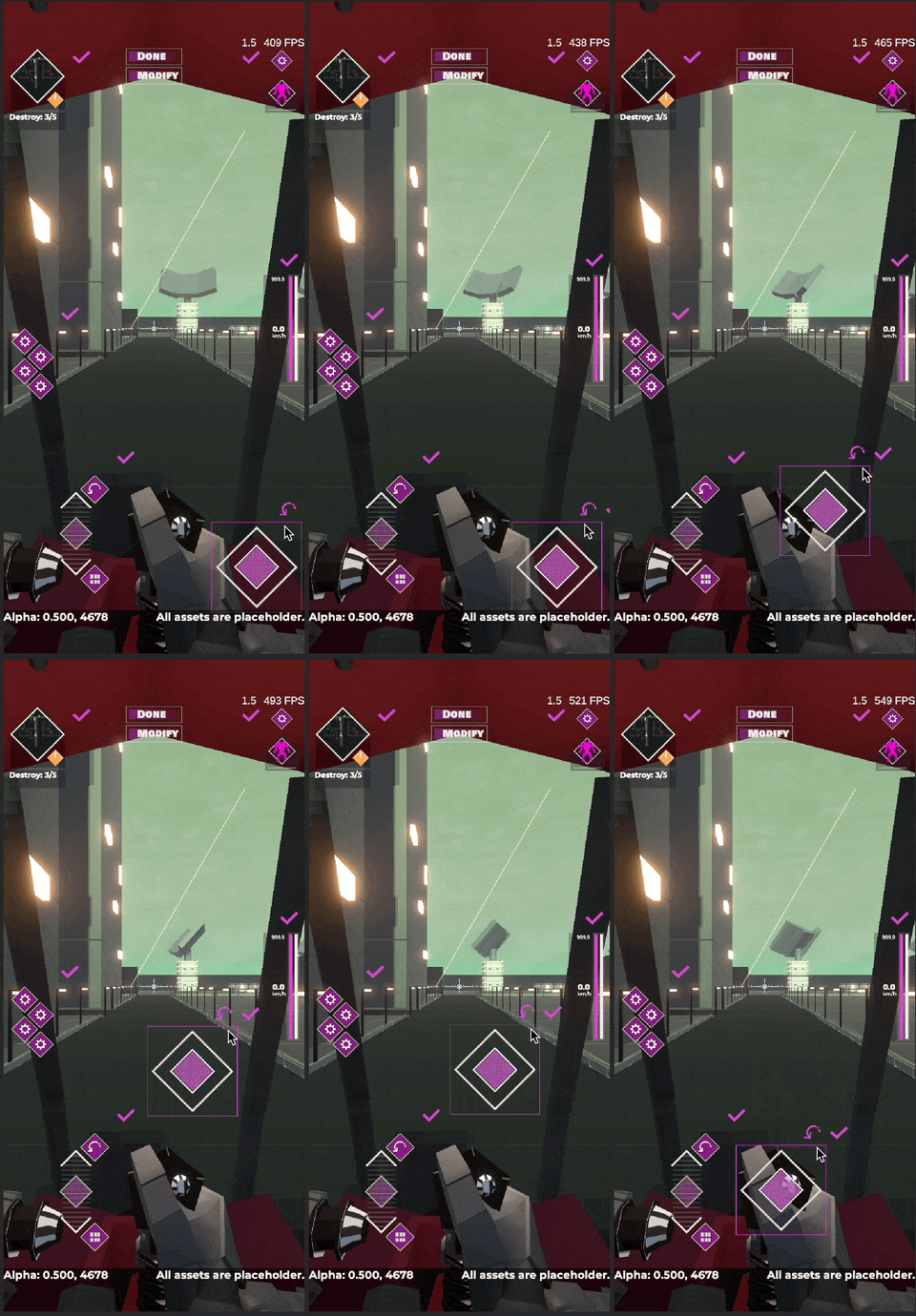
But, now there's visual clutter. Let me introduce you to another feature I did in Interloper that kinda sucked, and is much better this time around: UI Reorganisation. A staple of mobile games with a ton of onscreen controls, but something I think most games could benefit from. Its a mode you can go into in settings to reposition your UI in a way that suits you. It currently just allows for scale and position, but will also allow for turning elements on and off.

All in all I'm pretty happy with the progress made this week, Hoping that next week will wrap up the work on the HUD, leaving just one last UI screen to make (item compare) and then I'm onto more juicy gameplay stuff.