 Armylists are at the core of your expressions for the game, so it makes sense to pay special attention to them
This weeks wrap up is more of a combination of the past few weeks worth of work. Between Covid, working on Interloper and my kid staying home from daycare with yet another minor illness, I haven't had as much time as I'd like to work on Charge.
That said, I've made some strides with the games UI and the broader graphic design of the IP (yes, IP).
Armylists are at the core of your expressions for the game, so it makes sense to pay special attention to them
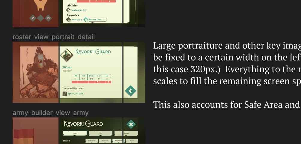
What started off as a font choice and a fixation on the colour teal ended up in the... graphic design for the whole game. Unlike Interloper or Unstoppable before it, Charge is a very UI heavy game, in particular the time you spend on creating and personalising your forces requires some serious UI considerations. On top of that, much the same as Interloper, I plan to launch Charge with support for screens as small as the iPhone Mini through to desktop and TV screens, this all requires thoughtful consideration for each UI element and how they respond to differing screen sizes.
 Sometimes design is just smacking shapes down, others it's carefully planning elements.
There's so much more to do with the graphic design, but as a first pass I'm damn happy with it. I've also spent some time this week working on UI systems, taking a look at what worked in Interloper, what didn't and formulating plans for how to make it all better for the next run.
 I wanted to show this one off because it's just sexy. Who said Dice Rolls can't be sexy?
I'm super happy with the way it's all coming together so far. But going through this pass has crystallised just how huge Charge is. It's a game I will release, I'm just not sure that it should be my next game.